It was important that we created a cohesive and interactive website to act as a hub for all the necessary information about the artist that worked in syngery with the other products and offered purchasing opportunities.
Home Page
I started off post-production on website and began with the Home page, creating the scrolling background, the video strip background and adding in the album information.
 |
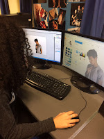
| Me editing the focal image for the home page |
Below is a photo of our home page. Please click to enlarge and read the annotations.
We also included a social media section at the bottom of the home page where the latest tweets and instagram posts could be seen as well as direct links to Spotify, the artists Instagram, Twitter, Facebook and YouTube channel. This was inspired by the social media section on Jason Derulo's website and a side by side comparison can be seen below.
Music Page
This page was actually one of the quickest pages to create as it is very straight forward and the only thing we had to wait for to complete it was the edit of the music video.
Tour Page
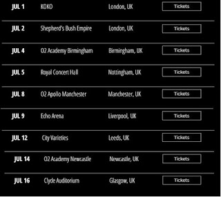
The Tour page contains all of the dates and venues of AJ's upcoming UK Tour, with links to Ticketmaster to buy tickets.
Below is a screenshot of the table on the tour page.
This page was actually a bit harder to create than some of the others as we originally tried to just edit the dates and venues in the template's tour table. This didn't work however, and in the end Meera created our own table separately and copied it into Wix afterwrads, adding all the buttons and links.
About Page
The About page starts with a quote from British music magazine NME, appealing to the crossoer audience with them.
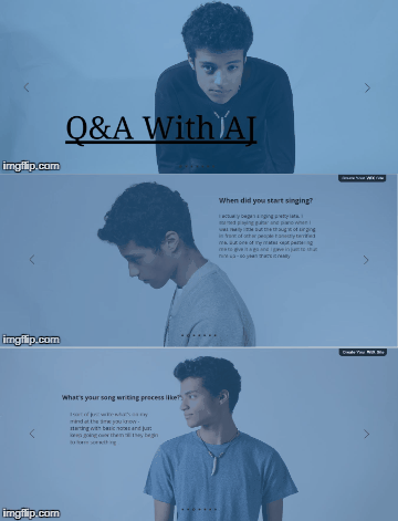
As well as this, I created a click through Q&A with AJ section on the About page, giving the fans an opportunity to get to know him. Below is an example of this.
Gallery Page
 This page consists of photos of AJ both promo shots and behind the scenes from the studio and location shoots. In addition to this we've added the behind the scenes footage of the music video as a fun extra for the fans to enjoy and to show AJ's goofy personality.
Shop Page
Again this page was very important as it was a huge purchasing opportunity for the audience. Whilst we originally thought that this page would be really hard to do, in reality it was a lot easier than we expected. Wix provided a really easy to follow and edit template which we customised for the products that we wanted - screen shots of which can be seen below.
 |
| Shop page |
 |
| Product detail |
The only thing I wish we had added to this, was a picture of a second angle of each product as you hover over it with the mouse, but unfortunately we ran out of time to do this. I am still very pleased with this page though and the range of products on offer.
News Page
The News page was were we put our competition, increasing the websites interactivity and linking in with social media as well as information about radio show appearances and an Instagram Live Event.
Below is a picture detailing our competition.
It was important that we had this because it gets the audience involved and actively participating and on social media will in turn help push a viral campaign with positive word of mouth which, ultimately, is the goal as free advertising.
Target Audience Feedback
After talking to members of our primary and secondary TA here are the findings from our feedback.
- The focal image on the home page was very popular - everyone liked it
- The repetition of the music video was good on both the home page and music page
- The behind the scenes video was funny and gave a good insight into the artist and the excitement of shooting a music video
- The website was very easy to navigate
- Social media links should be at the top of the page as well as bottom
I am really pleased with how the website came out overall, as it is clear and easy to use, ultimately doing its job as the main hub for all of the artist's information and we all picked up how to use the software very quickly.


No comments:
Post a Comment