


Below is the template that we used for the front and back outside panels - a similar template was used for the inside panels too.
 |
| Template |
Below is a picture of our final outside panels.

For the digipak I cut out both photos for the front and back panel using the select tool and and refine edge, taking care to paint back in any of Laith's hair that got cut to give a clean and believable look. In addition to this I edited the writing out of the original picture of the background for the back cover.
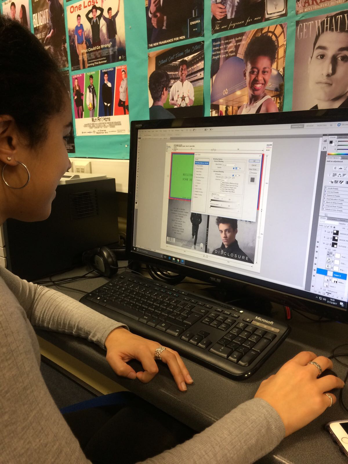 |
| Me editing the front panel |
For our artist name, album and song titles we had to download two new fonts: World Conflict and Questrial-Regular.
We chose World Conflict because we wanted something tat would stand out and look good repeated across all of the marketing platforms. The edgy, spray paint look fit with the British independent vibe we were creating as well as the simple, grungy, grey background.
 |
| World Conflict font |
For the album and song titles we wanted something simple and professional that contrasted nicely with World Conflict and didn't take away from the focal image. In the end we settled on Questrial-Regular.
 |
| Questrial-Regular font |
Both the backgrounds for the front and back cover were a similar grungy, grey colour with texture. As seen in our research and planning post this followed genre conventions and allowed the focus to stay on the artist's image which as a debut album is very important. Our main inspiration for the backgrounds was from 'The Best of Amy Winehouse's album cover which can be seen below.

For institutional information the back cover was very important and we had to ensure we included the record label logo, barcode, artist website, album release date and copyright.

Inside Panels
Below is a picture of our inside panels

Our inside left panel consists of a black and grey gradient of AJ's side profile filled with words that mean something to him and the album. Included are words such as 'dignity', 'change' and 'forgiveness', words that express AJ as a person and as an artist who wants to create music that really matters to people. We hoped that this idea would not only look visually interesting but also add a personal touch, as all the things that went round AJ's head when creating the album, giving an authentic feel to the digipak.
The right hand panel where the CD would be is a simple MS from behind AJ. We made the photo black and white to fit with the rest of the digipak and the black, grey and white colour scheme. We kept this panel simple as most of the time it would be covered by the CD.
In keeping with British indie feel and an artist that wants to bring back elements of old school R&B we thought that the simpler we kept the digipak concept the more effective it would be, especially with its colour scheme.
Target Audience Feedback
After speaking to members of both our primary and secondary audience we collected the following feedback on our digipak.
- The colour scheme works really well and is eye-catching
- The inside panel with the side profile and words was the favourite as it really stood out and wasn't commonly done
- It looked professional
- It wasn't always recognisable as R&B but those who said that went on to say that they would still look at the album because it was eye-catching and introduced the artist well
I am very pleased with our digipak and I really enjoyed editing the photos and creating the final product. I love the aesthetic we've gone for and am pleased that ideas I was really excited about carrying out right at the beginning of the project, such as the words in the head, actually came out really well and was liked by others.
No comments:
Post a Comment