


Below is our schedule for Edit Week 2.

When it came to grading our shots we wanted to make everything have a more blue/grey feel to it, inspired by Gone Girl as discussed in my research and planning posts. Grading was particularly important for the kitchen shots as when the lights were on they gave a very orange look which went against the low-key lit, somber atmosphere we wanted to create to fit the genre.
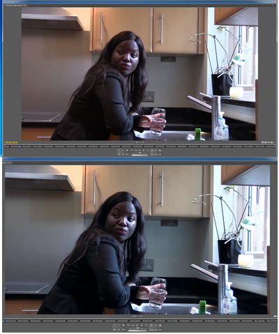 |
| Grading example: before (top) after (bottom) |
To grade our shots and create the look seen above, we used:
- Three-Way Colour Corrector
- ProcAmp
- Levels
We also had to create the titles and credits using LiveType on the MacBook. Our inspiration for them was Se7en and Shutter Island as previously discussed in research and planning. To create our desired unsettling look we used an effect called 'Stagger' in the Grunge category for all of the credits except the title, for which we used the 'Drop In' effect.
No comments:
Post a Comment